If you’ve ever finished a course or class that was really hard to follow, didn’t seem to deliver, was either too easy or too hard — it’s possible that poor instructional design (ID) is to blame. The opposite is of course, also true.
Basically, ID is a set of rules or a process for making training/classes do what they’re supposed to do. With it, we:
Determine our goals with the instruction. (You do have them, don’t you?)
Focusing on meeting those goals efficiently, meaning we try not to waste time, but don’t try to go too fast.
Measure to see if our goals have even been reached, both at the end and along the way.
Recognize that “Teach students X” or “Help students understand Y” or “Put students through a grueling, 14-week course of Z” are not appropriate goals.
Keep SWABAT in mind. (Students Will Be Able To)
ID has some advantages over simply dubbing someone a teacher and setting them loose to spew forth their alleged knowledge. Some of them are:
Analysis of whether to teach at all. (Believe it or not, education isn’t always the answer to a given problem.)
Cost effectiveness. In the long run, ID can make for more, better-educated, happier, less-bored, and more-capable students in the same amount of time.
It’s time effective. ID helps meet the right need of the right people at the right time.
This can lead to a competitive advantage. In fast-moving industries, good training is a valuable asset. For schools and universities, it’s plays a huge role in your credibility, respectability, and therefore, funding.
Consistency. Standardized, proven methodologies produce consistent quality results.
“Wow. So, there really aren’t any downsides,” you say. Well… not exactly true. In the short term, ID can take more resources, require more/different people than what you have, and involves more steps. But if you’re willing to pay the price, you’ll get results. Even a marginal application of ID principles can yield big differences in student wishing-they-would-enter-a-coma-rather-than-be-in-your-class-for-just-five-more-minutes-ness.
We discussed user testing in Intro to Instructional Design last week, and how testing your product or instruction with just one user can dramatically improve your product’s usability and effectiveness.
I found it interesting that around the same time, Google announced the Google Website Optimizer. At first, it sounds like this is made to make your site load faster or somesuch, but it’s actually much more than that. GWO is a free tool for conducting experiments and testing conversion rate — which essentially is the percentage of the time your visitors actually do what you want them to when they come.
The cool thing is that it lets you move things around on your page, for example, and it randomly serves up different versions of your site to people who visit. You can then look very closely at the data and see which variations of your page are proving most effective. The other great thing is that it tests both your target audience and people outside it.
I can think of a few ways this could prove very useful on our school’s websites. If you want to know more about it, check out A Beginner’s Guide to Google Website Optimizer on Kissmetrics.
Though it can be easy to think otherwise, web design is much more than just putting content on a site and calling it a day. And, because people interact differently with the web than with printed materials such as newspapers and magazines, we can’t treat it the same when we design for it. There are many facets to good web design, and this article is about one of the most important we need to think about when we design.
The Interface
Because the Web is so vast, it would do us well to remember Jakob’s Law. Coined by Jakob Nielsen of Web Usability fame, it states: “Users spend most of their time on other sites.” What this means is that users expect your website to work and behave in a similar way to the ones they already know.
Let me illustrate this point with a corporeal example: Imagine you borrow your friend’s car. You climb in, try to put in the key, and find that the ignition is not where you expect it to be. Instead of going in to the right of the steering wheel, you eventually discover that the key goes on the left side. You get the key in, and it doesn’t turn. After a minute of fiddling with it, you find out that it doesn’t turn clockwise, but counterclockwise—and you have to push on it first.
Well this is all pretty irritating, now isn’t it? And we’re only getting started! It turns out that the turn signal isn’t a lever on the left of the wheel, but a button on the wheel itself. The radio volume is controlled with a button on the floor by the pedals, and the windshield wipers are turned on an off from where the radio volume is supposed to be.
This is one aggravating car, isn’t it? Who designed this thing, anyway?
Someone who hasn’t driven many cars, apparently. You see, car designers might think the key would work better in a different place, but they never move it because no one would buy their annoying, hard-to-use cars if they did.
Don’t Confuse Your Visitors Away
You can probably see where I’m going with this. Though not quite to the same extent, websites are similar to our car. Think about some of the sites you’ve visited recently. I’d be willing to bet that the site’s logo was in the top left corner, and if there was a search box, that it was somewhere near the top, or around the upper-right corner. And I’ll bet colored words were almost exclusively links. I don’t even have to know what sites you go to to guess that because websites, like cars, have developed certain trends. Like it or hate it, if your search box is on the left side of the page at the bottom of the screen, a lot of people won’t even know you have one, and they’ll wonder why you don’t. After all, as Vitaly Friedman of Smashing Magazine says in this post, “if users can’t use a feature, it might as well not exist.”
Now imagine that your friend’s weird car is just one of millions you could be driving instead. (You’re famous, because everyone in the state wants to lend you their car.) Do you think you’d spend more than a few seconds in our problematic example one, or would you be in another, more familiar one in seconds? Like you and your millions of cars, web users have millions of websites they could be at instead of yours, and they won’t stand much in the way of confusing or frustrating layouts.
Try to avoid being the cause of this situation. And don’t try this at home.
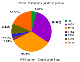
One way to avoid this making your site awkward or hard to use is to take some time to look at other sites with similar messages to yours. Because you’ll likely share your audience with those sites, you can get an idea of how your specific user base might expect your site to work. Additionally, you can do a search for web usability statistics and get some cold, hard numbers, like those from the W3Counter and Internet Usage World Stats. For instance, you would not want to design your site to be wider than 1440 pixels, because only a small percentage of web users have screens that wide according to global web statistics:
Source: www.w3counter.com/globalstats.php. Accessed Nov 17, 2009
But, you’re saying I can’t be creative!
No I’m not. Really, you can. You have a lot more flexibility than our awkward car above—the Internet isn’t nearly that fixed in its ways. And remember, we’re talking about how your site works, not how it looks. Cars all pretty much work the same, but they come in all kinds of different shapes, sizes, styles, and colors. And so should websites. The Internet would be a pretty boring place otherwise.
Last week’s discussion about visuals and interfaces really got me thinking about user interfaces. One of the biggest and most important challenges of user interface design is to organize your information in the best possible way—you can’t just put it on the screen and assume your visitors will know what to do with it.
Reading on the Web is Different
For instance, studies show that the majority of web users don’t stop to read every word on the screen. (See this sample chapter from Don’t Make Me Think by Steve Krug.) They read hard and fast, skimming more than anything. Therefore, if you want people to actually digest your information, you need to make it as easy to read and as well organized as possible. As the Web becomes more prevalent in all our lives — and those of your learners — I imagine this habit of skimming might easily apply to all forms of on-screen text, be it a web site, educational software, or Internet-based instruction.
Images Should Make Sense
Images should also be chosen carefully. Images do not typically, by themselves, convey meaning — at least, not the meaning you’re trying to get across. I once dealt with a client who insisted that the website I was creating for his event be dominated by two pictures: a handful of bullets on a book, and a globe painted on someone’s hand. I had to explain to him, that although these pictures were nice to look at—they didn’t say a single thing about what the event was, or why people should care about it enough to bother attending. It was the words that communicated our message, and the images were the garnish. You don’t go to a restaurant to enjoy the parsley with a small side of entree.
For a good article about using images on the web, check out this post by Nasir Mehmood.
Media is not a replacement for quality instruction.
Media is interchangeable; method is not.
Media are delivery vehicles for instruction and do not directly influence learning.
Media are not directly responsible for motivating learning.
Therefore, expensive media are uneconomical, because quality instruction could easily be delivered in a different and less expensive way.
Kozma argues that media are in fact important tools in instruction, worth the cost (when employed correctly), and that the use of media and technology does indeed have a tangible benefit on learning.
I was assigned to argue on the Clark side of things, and at first I was less than thrilled. Simply by reading the titles of the two author’s papers, I knew I agreed — strongly, even — with Kozma. But now, I’m not so sure. Clark does make some very interesting points. Considering the cost of media and computers, are we really getting our money’s worth in improved instruction? I’m not so sure we are.
Media and Motivation
On the other hand, I take issue with point #4 above. From my own experience, I have found this to be somewhat untrue. For over a decade, my father tried to get me to use a planner. He said it would improve my ability to keep on task, complete homework, and be on time. And he was right. I knew he was, so I let him get me one. Except — it never worked. I went through several planners in different sizes and shapes, and not one of them got used more than a day. It wasn’t until I got myself a Handspring PDA that suddenly things began to work. I found I actually used the thing. Not long later, I was able to use a program called AvantGo to have things from the Internet right in the palm of my hand. And, I started learning things. I read articles about the subjects that interested me — simply because I could. The media let me choose my own terms for learning, and my motivation increased. I was able to learn when I wanted to, when I felt I had the cognitive abilities to do so. Since then, things haven’t changed much. For years, I have almost always had my headphones on, but most of the time it’s not to rock out — I burn through podcasts like crazy. I review class lectures. I look up words and terms I don’t fully understand, and I take notes. I work on school projects anytime, from anywhere. Even collaboratively.
My first portable learning device: the Handspring Visor
Would I have learned as much as I have over the past 10 years without these media — if my learning was confined to heavy books, lectures to classrooms only given at certain times, whether my brain can handle them or not? I’m not so sure I would. These media have given me more motivation to learn because they let me do it on my own terms. I choose to learn all the time now, simply because I can. And the novelty has yet to wear off.
In The Middle
What about the rest of the argument? There are other points of Clark’s that I take some minor issue with, and some I definitely agree with. Same with Kozma. I feel that, from my own experience, they are both right. When done correctly, I do believe that computers and media can provide educational experiences well above the norm. But not always, and not for everyone. As with most of life’s great debates, I think the truth is somewhere in-between.
Last week we discussed the importance of developing assessments appropriate for the instruction we create.
During the lecture, I realized that often, a certain assessment may be assessing more than what I think it is going to. I spaced out (sorry, Prof. Monson) and started thinking about the math assessments I took while in school. Usually, I was assessed on my knowledge of, say, equations — but I was also assessed on my reading comprehension. If I’d had a conversation with my teachers, I imagine that they would not have listed reading comprehension as one of the things they were intending to test for by giving story problems on a math test. However, lengthy math story problems that contain the bulk of important information necessary for the task embedded in written context are really testing a student’s ability dissect the story problem and translate it into numbers before they ever use math. If a teacher gives story problems on a test without delivering enough instruction on reading comprehension necessary for the assessment (or ensuring that they get it somewhere else, like another class, at the same time), then they are, in fact, testing on something they did not teach.
This perspective on assessments is important when designing instruction in all kinds of instructional situations. Since instruction designed with assessment in mind, it is important to carefully select the assessment intended for use and analyze what is truly being assessed. If the assessment chosen requires instruction that we do not intend to give, then a different assessment should be chosen. Or, if it requires certain background knowledge, then the instructor should verify that the students have the knowledge necessary to do the assessment before it is given.
An example of this in media would be designing a message board for students to post responses to an assigned article. The intention is to test on what the students were supposed to have read, sure. But what we’re also (and likely without knowing it) testing on their ability to use a message board. (We could go farther, to the point of “well, duh” and add Internet connection and usage, basic computer skills, and school skills.) So the possibility exists that, before students are able to complete the task, instruction on how to use the message board should be considered. Or at the very least, we should know if they’ve already learned about message boards and make sure that those who can’t use them get trained. While this kind of instruction may not be part of the intended learning outcomes of the class, it is still part of the instruction because it is part of the assessment given.
Does this sound familiar? It’s an interesting throwback to the analysis phase of our instruction where we figure out what students already know and how to build on it, or what they need to know before we can give them our instruction. Especially when considering how to build appropriate tests, that phase seems all the more important now.
This was a forum posting for one of my classes. My response started becoming so long that I decided to put it here. After all, it’s a question worth exploring. Here’s the full question:
Do we need technology to reach today’s learners? Is a chalk board enough? How did we ever learn before the computer?
I would say yes, we do need it — but not necessarily because low-tech methods don’t/didn’t work. Just look at some of the advances made by humanity prior to 1960. Clearly, people were quite capable of learning before computers invaded the classroom.
I say yes mostly because of student expectations today. Today’s students were likely born in an age where there were never not computers, video games, and the Internet. Technology surrounds them in every aspect of their lives. It’s comfortable and familiar to them. There was never a time that it didn’t permeate their lives.
With the age gap widening, and technology becoming ever more important in almost every professional field, students are becoming increasingly confused and/or disillusioned when instructors avoid bringing it into the classroom. From my own experience with higher-ed students, the teachers that try to avoid technology are seen — at least to a degree — as bring outdated paper-wasters that are out of touch with the world that today’s will have to live in. I’ve heard many comments to the effect of, “Duh! Why do I have to turn this in on paper? Do they even know that email exists?” I’ve also seen instructors roll out overhead projectors and heard a quiet chorus of snickers and seen a wave of eye-rolling. Student engagement in these courses was often unimpressive.
That’s not to say that what Dr. Overhead Projector had to teach wasn’t perfectly relevant/interesting/useful. He/she often had plenty interesting information to offer, but the impression made by his/her avoidance of technology turned students off quicker than a power-outage. Most of these students were in their early to late 20s. Many of them had lived before the advent of the Internet. How will students born after the Web respond to all-paper classrooms, overhead projectors, chalkboards and pencil sharpeners?
On Tuesday in class we went over a simple trick in class. It’s one you might have seen before:
In your head (no calculators or pens, etc.), take 1000 and add 40 to it. Now add another 1000. Now add 30. Add another 1000. Now add 20. Now add another 1000. Now add 10. What did you get?
Most people say 5000, but it’s really 4100. Even though it wasn’t specifically related to Instructional Design, I wanted to learn the psychology behind the trick. The answer wasn’t easy to find, but it appears this has to do with Gestalt psychology. Within Gestalt is the law of similarity, or the tendency of the mind to group similar things together. A visual example would be this:
We naturally tend to see the line of Os in a field of Xs instead of 14 lines of 11 characters consisting of 10 Xs and one O with the placement of the O in each consecutive string being a function of pos.O = pos.O + 1. It’s a nice mental shortcut that usually saves us a lot of time and helps us see patterns. Good stuff.
Except when we group things together that shouldn’t actually be grouped. In the math trick above, we’re dealing with multiples of 10, and a whole bunch of 1000s. When we get to that last part, we have 4090 in our heads, and we add 10 to get… 5000. What’s going on is that with all those 1000s being thrown at us, we’re grouping the sum of 90 + 10 (100) into the same group as the 1000s. Which is why we roll the number up to a full thousand instead of 100. 5000 seems to fit the pattern our brains are seeing better than 4100. It’s as if we took the X and O pattern above and changed only one line:
Even though the imaginary line of Os is broken, you either might not see the break at all, or you sort of fill it in. Maybe it even kind of bugs you because you “know” there should be an O there. That’s another gestalt theory called continuance — our brains want detected patterns to continue, even if they’re broken somewhere along the way. It’s what helps us see the triangle in this image, even though there’s no triangle there:
What does any of this have to do with instructional design?
Well, work with me here. I think there are two ways it applies:
One of the things we’ve learned about in class is to “trust the model” — as in one of the models used to design instruction I wrote about earlier. Without following the model, we may design instruction that looks like some of those pictures above. We see the triangle, but do our learners? What could we be leaving out that they need to know? Would a child who has never really thought about what makes a triangle a triangle see the same thing we would? Or would she see three little black Pac-Mans looking at each other?
Oh 8, and 4. The things you can do.
Also, we’ve learned about in class how experts often can’t explain why they’re good at something. When they try to impart their skill to others, they often focus on details that don’t matter, or in the case of the pro baseball players saying “keep your eyes on the ball”, details that just don’t work. Their knowledge and expertise is complex, and if we were to draw it out we might see a line of Os in a field of Xs — the Xs being things that seem to matter but don’t. The expert doesn’t really know that they don’t matter — that a line of Os could be drawn against a field of anything, or even just empty space. They just don’t think about it because they never have to. They’re experts; not teachers. They see the triangle, well, um, because they just do!
It’s up to educational psychologists to understand these quirks of the mind — and that there’s an art and science to proper teaching. Otherwise, you might accidentally teach a whole classroom of students that 4090 + 10 = 5000.
You’ve probably heard the phrase, “measure twice, cut once.” It’s good advice, and it works very well for wood/plastic/metal. But what about instruction? Well, it’s pretty much the same–but with one major difference. The beauty of computer-aided learning is that a product is often never “finished” — meaning we have a final product that we’re stuck with. Especially with Internet-connected instruction, we have the ability to update, fix, and adjust all the time. An update to this post will show up to all of you, instantly, the second I make it. You don’t have to purchase or a new edition of it in order to see a typo corrected. What this means is that we don’t just measure twice — we measure always.
A popular model in instructional design is the “ADDIE” model. Here’s a good illustration:
Notice how evaluation — or in other words, measurement — is central to every part of the process, including implementation. It’s a two-edged sword, that. It means that by constantly evaluating how well our instruction is working, we can make for better learning experiences, even as we go along. On the other hand, that means more work for us. But why are we in our field if not to make effective instruction? I’d say the extra work is more than worth it.
Measuring as you go along isn’t just confined to instructional design. Take a look at this PR/Strategic Communications model:
It’s surprising how similar they are, especially when you know that planning around the “Target Setting” is included in the ADDIE model, too. It’s just a little further along and combined with Implementation.
Right now I work at a place that, instead of a 5-6 step model, has lived off a 1- maybe 2-step model for years: Implementation. Ideas flash in their bulbs and instantly — we’re creating a finished product. There isn’t really any planning as to how best to make it, who it will be for, how much it will cost, or even if it’s worth making in the first place. And we never evaluate afterward whether it was effective or did what we want, which is easy because we often don’t flesh out what we were trying to do in the first place. This has made for a series of half-finished, ineffective tools.
Now, I don’t want to make it sound too bad. We’ve done some cool stuff. But too much of it has been for nothing, and the stuff that works could work even better if we planned it out ahead of time. And things are getting better. Along with another instructional designer, we’ve slowly begun to convince people that we need to think before we act. Then we’re going to — hopefully — help them realize that we not only need to think before we act, but while we act, and that software/instruction/communication are not one-offs, but cycles.
So I’ve started the Instructional Design & Educational Technology graduate program at the University of Utah. The typical response when I tell people this is a momentary blank look, then a comment along the lines of, “Oh, good. We need more of those.” It’s true, we do. But why? What does “instructional design” even mean? Those are good questions with complicated answers. Let’s see if I can begin to articulate an answer here:
Ever had a class where you were bombarded with information, and you weren’t sure what any of it was for, why it was important, and what the main points you were supposed to get out of it were? (My most recent experience in this was my final Mass Media Law course, but that’s another story.) The answer is yes, you have. But in case you can’t remember it, here’s a fun video that illustrates the point:
Admit it. You’ve been in a class where you thought you were supposed to focus on the passes the white team makes — and then found a question on your final exam about a moonwalking bear.
Right there we get an answer to the first question: properly designed instruction is more than simply dumping information on people and expecting them to know what to do with it — Instead, it’s about helping the learners make sense of the information. And not only that, we help them focus on what’s important, and build up their knowledge in the right order and under the correct circumstances. (Learning theory calls this “scaffolding.”)
For example, think of all the things the narrator could have asked you to keep track of in that video. How many people were there? Where do you think they are? Get three sentences said by the players. What type of ball? Is that an ambulance or a police siren in the background? Which team is better? See? There’s a lot going on here. And what if the video had been in another language? What if you have poor eyesight and can’t see it very well — but you’re still tested the same as everyone else on what you see?
Instructional design helps learners get the information they need while skipping what’s not (or not yet) useful, and presents it in an appropriate manner, which all ends up saving time and money. And we like saving time and money.
There’s a whole lot more to it than this, but that’s scratching the surface. We’ll get deeper into the details later. As far as this post goes, Tom Kuhlmann explains it all in more depth over at articulate.com.