Though it can be easy to think otherwise, web design is much more than just putting content on a site and calling it a day. And, because people interact differently with the web than with printed materials such as newspapers and magazines, we can’t treat it the same when we design for it. There are many facets to good web design, and this article is about one of the most important we need to think about when we design.

The Interface

Because the Web is so vast, it would do us well to remember Jakob’s Law. Coined by Jakob Nielsen of Web Usability fame, it states: “Users spend most of their time on other sites.” What this means is that users expect your website to work and behave in a similar way to the ones they already know.

Let me illustrate this point with a corporeal example: Imagine you borrow your friend’s car. You climb in, try to put in the key, and find that the ignition is not where you expect it to be. Instead of going in to the right of the steering wheel, you eventually discover that the key goes on the left side. You get the key in, and it doesn’t turn. After a minute of fiddling with it, you find out that it doesn’t turn clockwise, but counterclockwise—and you have to push on it first.

Well this is all pretty irritating, now isn’t it? And we’re only getting started! It turns out that the turn signal isn’t a lever on the left of the wheel, but a button on the wheel itself. The radio volume is controlled with a button on the floor by the pedals, and the windshield wipers are turned on an off from where the radio volume is supposed to be.

This is one aggravating car, isn’t it? Who designed this thing, anyway?

Someone who hasn’t driven many cars, apparently. You see, car designers might think the key would work better in a different place, but they never move it because no one would buy their annoying, hard-to-use cars if they did.

Don’t Confuse Your Visitors Away

You can probably see where I’m going with this. Though not quite to the same extent, websites are similar to our car. Think about some of the sites you’ve visited recently. I’d be willing to bet that the site’s logo was in the top left corner, and if there was a search box, that it was somewhere near the top, or around the upper-right corner. And I’ll bet colored words were almost exclusively links. I don’t even have to know what sites you go to to guess that because websites, like cars, have developed certain trends. Like it or hate it, if your search box is on the left side of the page at the bottom of the screen, a lot of people won’t even know you have one, and they’ll wonder why you don’t. After all, as Vitaly Friedman of Smashing Magazine says in this post, “if users can’t use a feature, it might as well not exist.”

Now imagine that your friend’s weird car is just one of millions you could be driving instead. (You’re famous, because everyone in the state wants to lend you their car.) Do you think you’d spend more than a few seconds in our problematic example one, or would you be in another, more familiar one in seconds? Like you and your millions of cars, web users have millions of websites they could be at instead of yours, and they won’t stand much in the way of confusing or frustrating layouts.

Wild-haired man punches fist through laptop screen
Try to avoid being the cause of this situation. And don’t try this at home.

One way to avoid this making your site awkward or hard to use is to take some time to look at other sites with similar messages to yours. Because you’ll likely share your audience with those sites, you can get an idea of how your specific user base might expect your site to work. Additionally, you can do a search for web usability statistics and get some cold, hard numbers, like those from the W3Counter and Internet Usage World Stats. For instance, you would not want to design your site to be wider than 1440 pixels, because only a small percentage of web users have screens that wide according to global web statistics:
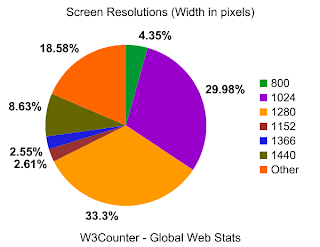
Screen width graph
Source: www.w3counter.com/globalstats.php. Accessed Nov 17, 2009

But, you’re saying I can’t be creative!

No I’m not. Really, you can. You have a lot more flexibility than our awkward car above—the Internet isn’t nearly that fixed in its ways. And remember, we’re talking about how your site works, not how it looks. Cars all pretty much work the same, but they come in all kinds of different shapes, sizes, styles, and colors. And so should websites. The Internet would be a pretty boring place otherwise.

For more info on what makes for a usable layout, and some excellent dos and don’ts, check out 10 Principles of Effective Web Design, and Research-Based Web Design & Usability Guidelines.


Last week’s discussion about visuals and interfaces really got me thinking about user interfaces. One of the biggest and most important challenges of user interface design is to organize your information in the best possible way—you can’t just put it on the screen and assume your visitors will know what to do with it.

Reading on the Web is Different
For instance, studies show that the majority of web users don’t stop to read every word on the screen. (See this sample chapter from Don’t Make Me Think by Steve Krug.) They read hard and fast, skimming more than anything. Therefore, if you want people to actually digest your information, you need to make it as easy to read and as well organized as possible. As the Web becomes more prevalent in all our lives — and those of your learners — I imagine this habit of skimming might easily apply to all forms of on-screen text, be it a web site, educational software, or Internet-based instruction.

Images Should Make Sense
Images should also be chosen carefully. Images do not typically, by themselves, convey meaning — at least, not the meaning you’re trying to get across. I once dealt with a client who insisted that the website I was creating for his event be dominated by two pictures: a handful of bullets on a book, and a globe painted on someone’s hand. I had to explain to him, that although these pictures were nice to look at—they didn’t say a single thing about what the event was, or why people should care about it enough to bother attending. It was the words that communicated our message, and the images were the garnish. You don’t go to a restaurant to enjoy the parsley with a small side of entree.

For a good article about using images on the web, check out this post by Nasir Mehmood.


Though it can be easy to think otherwise, web design is much more than just putting content on a site and calling it a day. And, because people interact differently with the web than with printed materials, it’s also not just another way to distribute your printed stuff.

Unlike other forms of media (such as print), web design focuses on three things:

The Look

This is the part that most people think of when they think about web design, but it’s not the whole thing. The Look is about more than just making a site pretty—it’s about making it appropriately pretty. In order to be effective, the design should match the message of the site.

Part of making this happen is ensuring that your site as a modern, professional look. Now, this doesn’t mean it needs to be winning any awards for its incredible eye-candy, but it does mean you want to avoid obvious errors such as broken images, typos, and a look that makes people think they’ve somehow traveled back in time to the 90s. (Or that they’re browsing this site.)

The look of your site affects the message you’re trying to convey. If your site is ridden with obvious errors or feels outdated, people are going to think that your message will suffer from the same problems. Think about it, if you were given a choice between shopping at two mattress stores, and one had immaculate landscaping and a clean exterior while the other didn’t, which one would you be more likely to trust? Whether you’re selling something or not, your website is your digital storefront. Make sure that you keep your proverbial windows clean and your sidewalk swept.

The Interface

Because the Web is so vast, it would do us well to remember Jakob’s Law of the Internet: “Users spend most of their time on other sites.” What this means is that users expect your website to work and behave in a similar way to the ones they already know.

Let me illustrate this point with a corporeal example: Imagine you borrow your friend’s car. You climb in, try to put in the key, and find that the ignition is not where you expect it to be. Instead of going in to the right of the steering wheel, you eventually discover that the key goes on the right side. You get the key in, and it doesn’t turn. After a minute of fiddling with it, you find out that it doesn’t turn clockwise, but counterclockwise—and you have to push on it first.

Well this is all pretty irritating, now isn’t it? And we’re only getting started! It turns out that the turn signal isn’t a lever on the left of the wheel, but a button on the wheel itself. The radio volume is controlled with a button on the floor by the pedals, and the windshield wipers are turned on an off from where the radio volume is supposed to be.

This is one aggravating car, isn’t it? Who designed this thing, anyway?

Someone who hasn’t driven many cars, apparently. You see, car designers might think the key would work better in a different place, but they never move it because no one would buy their annoying, hard-to-use cars if they did.

Though not quite to the same extent, websites are similar. Think about the sites you’ve visited recently. I’d be willing to bet that the site’s logo was in the top left corner, and if there was a search box, that it was somewhere near the top, or around the upper-right corner. And I’ll bet colored words were almost exclusively links. I don’t even have to know what sites you go to to guess that, because websites, like cars, have developed certain trends. Like it or hate it, if your search box is on the left side of the page at the bottom of the screen, a lot of people won’t even know you have one, and they’ll wonder why you don’t.

Now imagine that your friend’s weird car is just one of millions you could be driving instead. (You’re famous, because everyone in the state wants to lend you their car.) Do you think you’d spend more than a few seconds in that one, or would you be in another, more familiar one in seconds? Like you and your millions of cars, web users have millions of websites they could be at instead of yours, and they won’t stand much in the way of confusing or frustrating layouts.

Now, that’s not to say that you can’t be creative. You can. You have a lot more flexibility than the car above—the Internet isn’t that fixed in its ways. But you want to make sure that your site isn’t confusing or hard to use. Look at other sites with similar messages to yours, and see what they do. Are there any patterns or trends?

The Information

One of the biggest, but most important challenges of web design is to organize your information in the best possible way—you can’t just put it on the screen and assume your visitors will know what to do with it.

For instance, studies show that the majority of web users don’t stop to read every word on the screen. They read hard and fast, skimming more than anything. Therefore, if you want people to actually digest your information, you need to make it as easy to read and as well organized as possible.

Images should also be chosen carefully. Images do not typically, by themselves, convey meaning—at least, not the meaning you’re trying to get across. I once dealt with a client who insisted that the website I was creating for his event be dominated by two pictures: a handful of bullets on a book, and a globe painted on someone’s hand. I had to explain to him, that although these pictures were nice to look at—they didn’t say a single thing about what the event was, or why people should care about it enough to bother attending. It was the words that communicated our message, and the images were the garnish. You don’t go to a restaurant to enjoy the parsley with a small side of entree.


Your mother probably told you not to judge a book by its cover. While this is certainly sound advice, it turns out it just isn’t practical—at least not when it comes to the Internet. While many web designers, developers, and content managers have heard the expression that substance trumps presentation, research done at Stanford University suggests that a website’s appearance may have a bigger impact on user impressions than one might think. What this suggests is that, while content remains king, web users really do judge websites by the design.

One way that users judge a website’s design depends on how tailored—or not—it seems to be to its target audience. The research linked to above found that websites properly tailored to their audiences were more credible, and therefore more effective. For example, if you are a music producer and you want to appeal to a young female demographic, it is critical that your design reflect the interests of this group. Your site would need appropriate colors and graphics. Displaying a site that is primarily grey and has no links to other popular interests for the target demographic would be less than ideal. Remember, “Quality in web design is the degree of fulfillment of the user’s expectations.” -Anders Toxboe of UI-Patterns.com. I recommend reading the article it comes from, which you can find here.

Thinkgeek.com is appropriately designed for its audience.
ThinkGeek.com, an online store for “geeks” is appropriately themed for its audience.

Once your visitors are hooked on your design, other factors come into play, such as the quality of your content, number of errors, rate of updates, ease of use and trustworthiness of your authors. Although useful content is of the utmost importance, we can’t forget how much our links, graphics, ads, promotions and such contribute to visitors’ perceptions of our sites.

A 2006 study performed by researchers at Pace University discovered a significant connection between website design and visitors’ attitudes toward those sites. A site may contain information that a user is seeking, but if that information is difficult to find, or presented in an amateurish or unprofessional layout, users are likely to form a negative impression of that site. (Read the study here: PDF)

Webpagesthatsuck.com showcases sites with unprofessional, amateurish, and generally bad design. The goal is to learn what not to do by seeing some of the best of the worst.

The same study concluded that visually attractive websites have been shown to produce a “halo effect” that forms a positive impression in users’ minds. Users see a visually appealing site and assume that the organization behind the site is just what they are looking for and can provide the services they need.

Although there are many things that can be done to foster trust, a professionally designed website, appropriate to your target audiences, is a critical component to creating a positive first impression with an audience. Website design cannot be ignored as a key component of any successful enterprise. Think about it, if you were given a choice between shopping at two mattress stores, and one had immaculate landscaping and a clean exterior while the other didn’t, which one would you be more likely to trust? Whether you’re selling something or not, your website is your digital storefront. Make sure that you make it someplace your customers will want to shop.

For more on building trust, check out Stanford’s Web Credibility Project.

Blog Pages