
Not that many people are even doing this these days, but I just ran into a couple of them and suddenly feel it’s worth mentioning again. Splash pages are pure evil.
(Okay, maybe not pure evil. But some kind of evil, for sure, even if it’s just the annoying kind.)
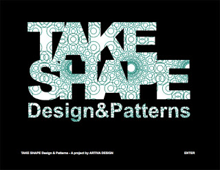
What is a splash page, you ask? You’ve probably seen them. It’s a sort of front door to a website, and they are often made with Flash. Here’s an example:
Pretty, right? Well, yes. But why is it there?
The lure of a splash page is that it gives us a chance to show off. It’s like saying, “Look, we’ve made some really cool stuff in Photoshop,” or, “Check out this excellent Flash animation!” What better place to show the world what we can do than right off the bat at the front of our site, right?
Wrong. Think about other sites you’ve visited. Why did you go to that site? Probably because you wanted something—because you had a question you wanted answered, or you wanted to see someone’s artwork or photos, read some articles, or contribute to a forum or community. Maybe we’ve visited Take Shape to look at some of their fine abstract patterns.
Does a splash page help us do any of that? We want patterns, or whatever, not another reminder of where we already know we are. Splash pages usually offer no other options than to “skip intro” or “enter the site”. Isn’t that what we were already trying to do when we entered the URL or clicked on a link?
It’s the same with our visitors. They didn’t come to be wowed by a fancy introduction. They came for a reason, and they want to get to it without any unnecessary interruptions. (Especially on the 2nd, 4th, and 8th visits, if you can get them to come back at all.)
Famed web usability expert Jakob Nielsen had this to say about splash pages:
Splash pages are useless and annoying. In general, every time you see a splash page, the reaction is ‘oh no, here comes a site that will be slow and difficult to use and that doesn’t respect my time.’
Source: Readers’ Comments on the new Top-10 Design Mistakes.
Furthermore, when splash pages are made with Flash, the opportunity for frustration (and people immediately leaving your site) increases even more. There’s nothing like browsing the web late at night in the dark, or in a quiet study hall or library, and then suddenly have some designer’s favorite rap song blast through your speakers at full volume. And the potential issues go well beyond the inappropriate use of sound. Jeff Noble of the usability blog User Interface Trends makes a good point about animation:
Animation just because you can do animation, like it’s possible or whatever, is very very bad. Please stop. Visitors come to a website for information, not to learn how awesome you are in vague generalities and exploding 3d text. Kaboom!
If you know Flash, create something useful or appropriately entertaining, not a fancy splash page that will only drive users away. We make websites because we want visitors. Don’t give them reasons to avoid your site.
Oh, but there’s always a catch.
That said, there are very rare and specific cases in which a splash page can be useful. If you think you might be dealing with such a case, I’d recommend checking out these two posts by Smashing Magazine, Splash Pages: Do We Really Need Them? and Exploring Design: Outstanding Start Pages. Also, there’s Jakob Nielsen’s dated but still fairly relevant, Flash: 99% Bad.
