A lot of people ask me, “Your domain is AwesomeToast… but what does that mean?”

This is often a very difficult question to answer, as the definition of awesome toast is complex and varied — only some of which actually relate to toast as it is commonly understood. That said, I believe the following video begins to scratch the surface and gives an effective (and mouth-watering) demonstration of the fundamentals of awesome toast. Watch as chef Daniel Humm creates the grilled cheese sandwich of the gods:

[YouTube via Gizmodo via Feast]


On Tuesday in class we went over a simple trick in class. It’s one you might have seen before:

In your head (no calculators or pens, etc.), take 1000 and add 40 to it. Now add another 1000. Now add 30. Add another 1000. Now add 20. Now add another 1000. Now add 10. What did you get?

Most people say 5000, but it’s really 4100. Even though it wasn’t specifically related to Instructional Design, I wanted to learn the psychology behind the trick. The answer wasn’t easy to find, but it appears this has to do with Gestalt psychology. Within Gestalt is the law of similarity, or the tendency of the mind to group similar things together. A visual example would be this:

OXXXXXXXXXX
XOXXXXXXXXX
XXOXXXXXXXX
XXXOXXXXXXX
XXXXOXXXXXX
XXXXXOXXXXX
XXXXXXOXXXX
XXXXXXXOXXX
XXXXXXXXOXX
XXXXXXXXXOX
XXXXXXXXXXO

We naturally tend to see the line of Os in a field of Xs instead of 14 lines of 11 characters consisting of 10 Xs and one O with the placement of the O in each consecutive string being a function of pos.O = pos.O + 1. It’s a nice mental shortcut that usually saves us a lot of time and helps us see patterns. Good stuff.

Except when we group things together that shouldn’t actually be grouped. In the math trick above, we’re dealing with multiples of 10, and a whole bunch of 1000s. When we get to that last part, we have 4090 in our heads, and we add 10 to get… 5000. What’s going on is that with all those 1000s being thrown at us, we’re grouping the sum of 90 + 10 (100) into the same group as the 1000s. Which is why we roll the number up to a full thousand instead of 100. 5000 seems to fit the pattern our brains are seeing better than 4100. It’s as if we took the X and O pattern above and changed only one line:

OXXXXXXXXXX
XOXXXXXXXXX
XXOXXXXXXXX
XXXOXXXXXXX
XXXXOXXXXXX
XXXXXOXXXXX
XXXXXXOXXXX
XXXXXXXOXXX
XXXXXXXXOXX
XXXXXXXXXXX
XXXXXXXXXXO

Even though the imaginary line of Os is broken, you either might not see the break at all, or you sort of fill it in. Maybe it even kind of bugs you because you “know” there should be an O there. That’s another gestalt theory called continuance — our brains want detected patterns to continue, even if they’re broken somewhere along the way. It’s what helps us see the triangle in this image, even though there’s no triangle there:

Examples of continuance in gestalt psychology

What does any of this have to do with instructional design?

Well, work with me here. I think there are two ways it applies:

One of the things we’ve learned about in class is to “trust the model” — as in one of the models used to design instruction I wrote about earlier. Without following the model, we may design instruction that looks like some of those pictures above. We see the triangle, but do our learners? What could we be leaving out that they need to know? Would a child who has never really thought about what makes a triangle a triangle see the same thing we would? Or would she see three little black Pac-Mans looking at each other?
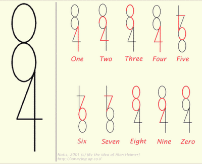
Oh, 8 and 4. The things you can do.
Oh 8, and 4. The things you can do.

Also, we’ve learned about in class how experts often can’t explain why they’re good at something. When they try to impart their skill to others, they often focus on details that don’t matter, or in the case of the pro baseball players saying “keep your eyes on the ball”, details that just don’t work. Their knowledge and expertise is complex, and if we were to draw it out we might see a line of Os in a field of Xs — the Xs being things that seem to matter but don’t. The expert doesn’t really know that they don’t matter — that a line of Os could be drawn against a field of anything, or even just empty space. They just don’t think about it because they never have to. They’re experts; not teachers. They see the triangle, well, um, because they just do!

It’s up to educational psychologists to understand these quirks of the mind — and that there’s an art and science to proper teaching. Otherwise, you might accidentally teach a whole classroom of students that 4090 + 10 = 5000.


iTunes 10. Good stuff. But I’m really surprised that Apple — who are known for their design expertise — would not only violate a well-known design convention, but their own well-known design convention with those stoplight control buttons. It may seem like a simple annoyance, but multiply it by 1000 times over the course of a week or a month, and you have a fairly irritating problem.

Fortunately, putting those buttons back the way they should be is pretty easy. (Mac only)

1. Close iTunes if it’s open.
2. Open up Terminal.
3. Copy/paste this line into it:

defaults write com.apple.iTunes full-window -1

4. Mash Enter.

Done. Re-open iTunes and enjoy.


You’ve probably heard the phrase, “measure twice, cut once.” It’s good advice, and it works very well for wood/plastic/metal. But what about instruction? Well, it’s pretty much the same–but with one major difference. The beauty of computer-aided learning is that a product is often never “finished” — meaning we have a final product that we’re stuck with. Especially with Internet-connected instruction, we have the ability to update, fix, and adjust all the time. An update to this post will show up to all of you, instantly, the second I make it. You don’t have to purchase or a new edition of it in order to see a typo corrected. What this means is that we don’t just measure twice — we measure always.

A popular model in instructional design is the “ADDIE” model. Here’s a good illustration:

Notice how evaluation — or in other words, measurement — is central to every part of the process, including implementation. It’s a two-edged sword, that. It means that by constantly evaluating how well our instruction is working, we can make for better learning experiences, even as we go along. On the other hand, that means more work for us. But why are we in our field if not to make effective instruction? I’d say the extra work is more than worth it.

Measuring as you go along isn’t just confined to instructional design. Take a look at this PR/Strategic Communications model:

It’s surprising how similar they are, especially when you know that planning around the “Target Setting” is included in the ADDIE model, too. It’s just a little further along and combined with Implementation.

Right now I work at a place that, instead of a 5-6 step model, has lived off a 1- maybe 2-step model for years: Implementation. Ideas flash in their bulbs and instantly — we’re creating a finished product. There isn’t really any planning as to how best to make it, who it will be for, how much it will cost, or even if it’s worth making in the first place. And we never evaluate afterward whether it was effective or did what we want, which is easy because we often don’t flesh out what we were trying to do in the first place. This has made for a series of half-finished, ineffective tools.

Now, I don’t want to make it sound too bad. We’ve done some cool stuff. But too much of it has been for nothing, and the stuff that works could work even better if we planned it out ahead of time. And things are getting better. Along with another instructional designer, we’ve slowly begun to convince people that we need to think before we act. Then we’re going to — hopefully — help them realize that we not only need to think before we act, but while we act, and that software/instruction/communication are not one-offs, but cycles.

Wish us luck. We’re going to need it.


So I’ve started the Instructional Design & Educational Technology graduate program at the University of Utah. The typical response when I tell people this is a momentary blank look, then a comment along the lines of, “Oh, good. We need more of those.” It’s true, we do. But why? What does “instructional design” even mean? Those are good questions with complicated answers. Let’s see if I can begin to articulate an answer here:

Ever had a class where you were bombarded with information, and you weren’t sure what any of it was for, why it was important, and what the main points you were supposed to get out of it were? (My most recent experience in this was my final Mass Media Law course, but that’s another story.) The answer is yes, you have. But in case you can’t remember it, here’s a fun video that illustrates the point:

Admit it. You’ve been in a class where you thought you were supposed to focus on the passes the white team makes — and then found a question on your final exam about a moonwalking bear.

Right there we get an answer to the first question: properly designed instruction is more than simply dumping information on people and expecting them to know what to do with it — Instead, it’s about helping the learners make sense of the information. And not only that, we help them focus on what’s important, and build up their knowledge in the right order and under the correct circumstances. (Learning theory calls this “scaffolding.”)

For example, think of all the things the narrator could have asked you to keep track of in that video. How many people were there?  Where do you think they are? Get three sentences said by the players. What type of ball? Is that an ambulance or a police siren in the background?  Which team is better? See? There’s a lot going on here. And what if the video had been in another language? What if you have poor eyesight and can’t see it very well — but you’re still tested the same as everyone else on what you see?

Instructional design helps learners get the information they need while skipping what’s not (or not yet) useful, and presents it in an appropriate manner, which all ends up saving time and money. And we like saving time and money.

There’s a whole lot more to it than this, but that’s scratching the surface. We’ll get deeper into the details later. As far as this post goes, Tom Kuhlmann explains it all in more depth over at articulate.com.


We have Windows 7 Home Premium 3-bit on one computer and suddenly couldn’t change the wallpaper. This seems to be a problem out there. There can be various ways to fix it. This one worked for us:

  1. Hit the Start ball
  2. Type “adjust appearance”
  3. A link called “Adjust the appearance and performance of Windows” will appear. Click that.
  4. Toggle the top check box “Animate controls and elements inside windows”


Worked for us. Your actual mileage may vary.


Oooh! This has us mildly steamed:

http://indylaw.indiana.edu/programs/simulation/info.htm

So they totally ripped-off our annual counter-terrorism simulation. No big deal. Frankly, IndyLaw, we’re flattered. Even if you pretty much copied us on everything from your fake CNN site right down to what you named your live video feed.

But hey, it’s cool—until you allude that yours might be the first counter-terrorism simulation of its kind.

Not cool, IndyLaw. Not cool.

In any case, the real first-of-its-kind simulation (started in 2007) is coming again in 2010, and it’s going to be excellent.

And here’s a little documentary about it:

Blog Pages